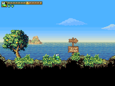
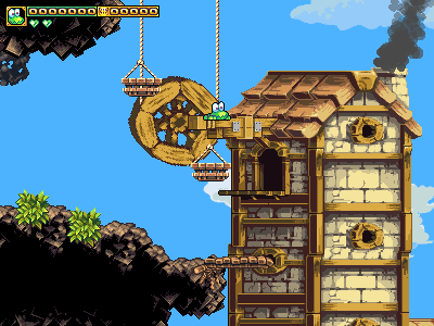
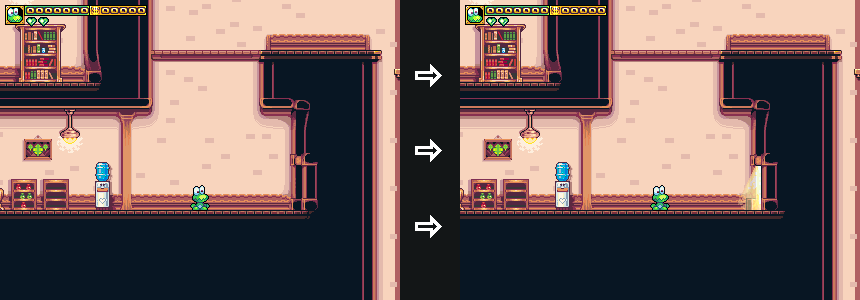
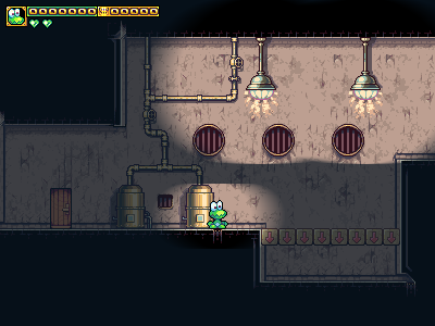
We’ve added a long-standing omission, somewhat bizarre for how simple it is: signs. And yes, you can read the signs with that goofy “not really any real language” lettering on them, in-game.
As an aside, as wil shipley has eminently noted, you really want to completely avoid having any text “burned into” your in-game images, because it’s total hell to internationalize. Not only do you run into all sorts of messes from the images needing to change size to accommodate different languages (some languages can easily triple the length of your text), but you also run into the problem that nearly all translators are not skilled graphic-designers, and will often do a terrible job re-creating your lettering in a different language. They’ll often botch really basic stuff like kerning and balancing letter-weight across lines of symmetry, etc. So if you’re wondering why frogatto and many other games always rely on “gibberish/greeking” to do text, this is why. It’s not just artistic caprice; there’s a strategy to it. (Having text that’s procedurally rendered, on the other hand, is fine and good.)

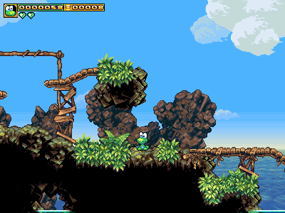
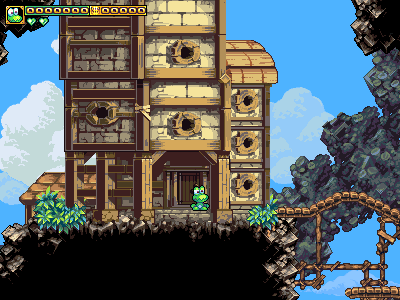
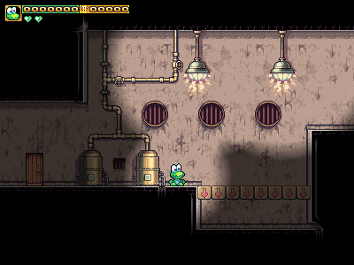
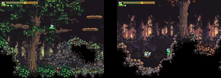
As you probably noticed in that picture, the colors are rather different from the usual palette in the seaside chapter of the game. We’ve just added two new palettes to the seaside environment. Here’s another shot of that verdant/green one, and then a shot of the one being used in-town.


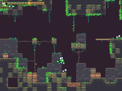
As you can see in the above, I’ve also gone around and given all the houses some interfacing between the houses and the rock beneath them. You can consult current (~1.0.3 for future reference) screenshots for a comp, but the current seam is pretty nasty. The solution was not just a matter of drawing foundations, but a matter of drawing foundations with an irregular edge, and luminosity close to that of the rocks, so that it’s not immediately obvious where the house ends, and the rocks begin. It’s that subtle bit that I didn’t really have a grip on, before.

(click to zoom in)
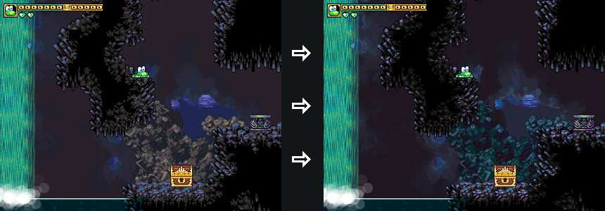
Finally, we’ve touched up one of our (previously unused) palettes from the cave. What makes the new one better is very subtle. Here’s some advice on doing pixel-art color ramps (note: luminosity is in units of the L*a*b color space):
1] luminosity differences less than 10 become hard to notice, except on very large surfaces that are very gradually changing their angle of incidence towards the light. Differences below 5 are almost a sure-fire waste of a color, because a human eye, at (normal) pixel-art display sizes (which range from maybe 100-30 dpi) can’t really see these very well, and having more colors tends to lose the workflow benefits of pixel art.
2] you want to space your colors such that if you were to map the luminosity of each color ramp as a graph/function, your function’s derivative would be monotonic (e.g. don’t reverse the polarity of the second derivative, e.g. don’t let the second derivative have any inflection points). Since I imagine that sentence is largely incomprehensible to non-mathematicians (sorry!), here are some examples. These are the distance between each different color, in brightness: 5,5,6,6,7,8,10,12 is good. 5,8,4,9,12,6 is bad. 5,5,6,5,7,8,6,9 is borderline. The math-speak above is an example of how math is unique in being able to directly express ideas we can only otherwise sort of “feel the outline of” via examples, but can’t directly grapple with. Cred probably goes to my old math prof Dr. Zorn for so eloquently stating that in an article of his, but it’s true. Without math, we can kinda-sorta understand these ideas intuitively, but when you can understand them explicitly, it opens whole new worlds for you. By having rules, you can reinforce things that your intuition suggests, and also make daring leaps of experimentation based on what the numbers suggest will work. (Amongst other things, I think my understanding of math/science has seriously fast-tracked my learning to draw, since things like shading were completely demystified by it. I only started drawing at all some 5 years ago.)
3] One of those aforementioned “daring leaps” is behind much of the interesting variation in my palettes. Within reason, if you hold luminosity constant, you can change the chromacity of a palette element to practically anything (as long as you don’t go completely overboard with saturation), and more often than not, it will work. Even something insane like pink highlights on a green tree. It can help to have environmental justification (such as a blue sky causing blue secondary-highlights on a tree’s branches), but it’s amazing what still works even without that, as long as you still get the luminosity correct.
4] even in a dark scene, use a wide gamut, and just bend what photoshop calls the (luminosity) “curves” downward. Darks should still be very dark, brights, bright. It’s the stuff in the middle that should get bent downward, but without breaking the relative distances between each palette element.


