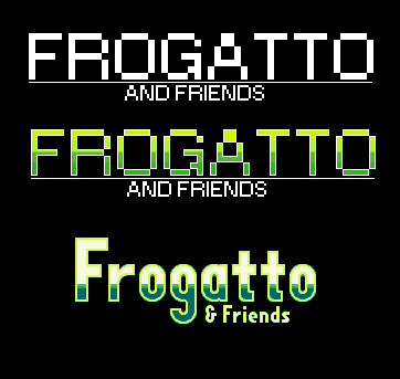
We try to put the horse before the cart, here, so one of the last things we’ve bothered to put effort into is our logo, since without a good game to slap it on, a fancy logo isn’t worth anything.
I’ve made a new logo for frogatto (hand-pixeled, drew the letterforms from scratch). I think it’s about the same level of charm as the previous logo we had before, but is a lot more readable. In the attached image, you can see the progression from old-> new. The website will be updated shortly to reflect this.


http://indie-fund.com/ – might this be relevant to your interests? 🙂
I don’t think that’s relevant to us right at the moment, but it’s definitely interesting and good to know – thanks for the link!