Since the first versions of frogatto, an implicit part of The Plan™ has been to do the tile graphics in a somewhat simple, cartoonish style. This was for a bunch of reasons, but it was generally to make it easier. Easier in terms of simply being less work. Easier in terms of ‘not requiring more skill than we have’. Easier in terms of just being clean by default, since geometric, cartoonish shapes tend not to have odd tiling errors which more erratic styles of organic patterning tend to cause.
You’ve seen this art in both major revisions of frogatto’s graphical style; both the really early test tiles, and the current stuff that’s been holding us for essentially the whole lifetime of the project. And we’re now taking it to the chopping block.
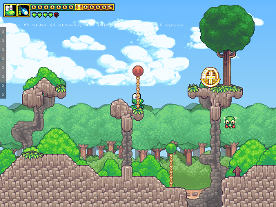
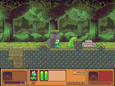
We’ve decided to completely change this part of the plan (for our tile art). The crux of this was a motivational problem. Neoriceisgood and I are both rather good sprite artists by now, and the simple art we were hacking on was neither challenging to do, nor was it something we could really be proud of. If we have the skill, and are spending a year or so on the project anyways, we may as well do the best job we can. Especially when, although the art cost per major environment mushrooms a bit (2-3 weeks versus 1 week), the entire rest of the game project is essentially the same in manpower costs. Levels don’t take any longer for us to design (due to our autotiling system, which I’ll describe in another post), the code is mostly done at this point (pareto principle notwithstanding), and the object scripting doesn’t change at all to accommodate this.
It will take more time, and this is normally a Very Bad™ decision in a game development project, but we’re not on a fixed budget, we’re skilled enough to do it, and it’s necessary for this to be something we were proud of having made. If there’s a purpose to approaching these projects from an ‘indie’ direction, having the liberty to do it right is foremost.
At the current point in time, we’ve basically overhauled all the art for both the world-1 environment (which has changed to a background of ocean, rather than light forest), and most of the world-2 deep-forest environment. We still have a good bit of work to do to catch up; we need to overhaul the dungeon environment, and we need to provide interiors for world-1, but we’ve tested the waters on this, and I think this is a sound plan going forward. Here are a few screenshots:
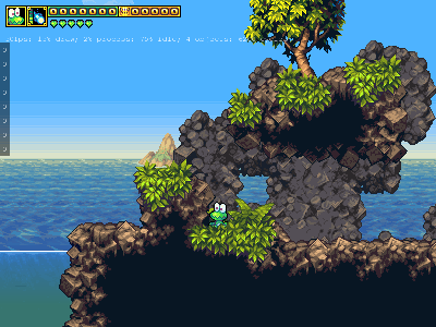
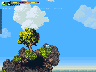
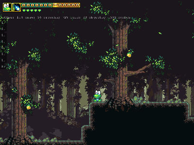


Well, it is worrying that the art will take longer, but if you are two to three times more motivated it works out, mathematically. 😉 And, you’ve already made quite a lot of fabulous art in the new style. I liked the old style, it was cheerful and simple. However, this new style definitely has a ‘wow’ factor to it. What feel are you aiming for with this new style? It has certainly changed the feel of the game, making it more serious. My last impression, a few days (… weeks?) ago was of a slightly edgier game.